Rubio Orders State Department to Drop Calibri, Reinstates Times New Roman
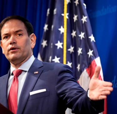
U.S. Secretary of State Marco Rubio on Tuesday ordered diplomats worldwide to stop using the Calibri typeface in official communications and revert to Times New Roman, marking what critics call another chapter in the Trump administration’s campaign against diversity, equity, inclusion and accessibility (DEIA) initiatives.
NEWS
staff
12/11/20252 min read

U.S. Secretary of State Marco Rubio on Tuesday ordered diplomats worldwide to stop using the Calibri typeface in official communications and revert to Times New Roman, marking what critics call another chapter in the Trump administration’s campaign against diversity, equity, inclusion and accessibility (DEIA) initiatives.
According to NBC News, in a Dec. 9 internal cable titled “Return to Tradition,” Rubio denounced the 2023 decision by then-Secretary Antony Blinken to adopt Calibri — a modern sans serif font — as “wasteful” and informal, asserting that it failed to achieve promised accessibility benefits and undermined the perceived professionalism of diplomatic correspondence. Rubio’s directive reinstates the classic serif font and standardizes 14-point Times New Roman for all department paperwork, aligning with President Donald Trump’s broader “One Voice for America’s Foreign Relations” policy.
Rubio’s memo claimed the previous change, initiated under Biden’s administration to address readability for individuals with visual impairments and recommended by the State Department’s Office of Diversity and Inclusion, had incurred unnecessary costs and did not fulfill its goals. The directive takes effect immediately, and existing document templates must be updated to reflect the return to Times New Roman, with limited exceptions — such as Courier New for treaty or presidential appointment paperwork.
The decision is viewed by administration allies as a symbolic restoration of tradition and gravity to what are often highly sensitive diplomatic texts. Rubio and other Trump officials have been systematically dismantling DEIA programs across federal agencies since the administration’s January inauguration, eliminating offices, cutting funding and rescinding policies aimed at promoting inclusion.
Accessibility advocates and some design experts, however, warn that serif fonts like Times New Roman are not universally easier to read — especially for people with certain visual impairments such as dyslexia, who often benefit from sans serif typefaces like Calibri. They argue that the font change may inadvertently reduce readability for some users.
The spat over typography highlights the cultural and political tensions over DEI initiatives in government communications. What may appear a minor stylistic choice to some has become a flashpoint in the wider debate over tradition, professionalism and accessibility in official U.S. policy.
Connect
Discover businesses aligned with your values today.
info@goodmoney-app.com
© 2025. All rights reserved.
Write your text here...
A Subdivision of Original Media Group LLC.